Service mapping and different types of maps
Written by Ben Holliday. Based on work developed with Kirsty Sinclair and feedback from the FutureGov design team.
There’s a question of why designers make so many maps. We love maps. But there can be confusion or misunderstandings about why we’re making them or how they can be useful to service teams.
Maps are the tools we use to make sense of the world we’re in. They’re great for starting conversations. They help teams and stakeholders to understand interactions with a service across touchpoints over time. They can be used as a research tool, for planning and operating services, and for storytelling.
This is an illustration showing the different types of maps you might create when designing, building or running a service.
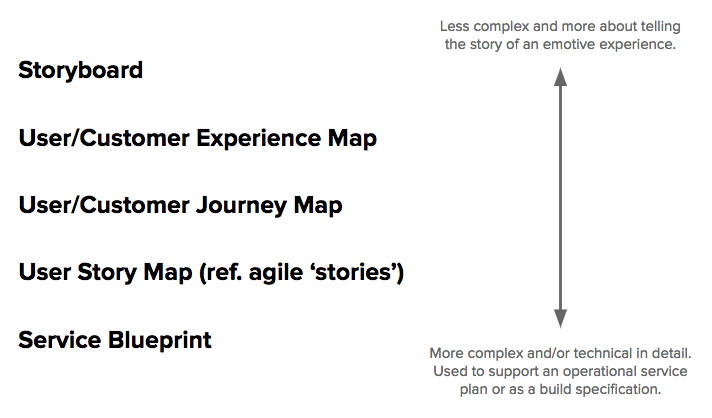
Deciding how best to draw a map of a service or future view of a service depends on how you intend to use it.
The types of maps towards the top of the list are likely to be less complex and are more about telling the story of an emotive experience. Towards the bottom of the list we find artefacts such as service blueprints that are likely to be more complex and/or technical in detail. These are more likely to be used in support of an operational service plan or as a build specification.
Different types of maps in service design
1.Storyboards
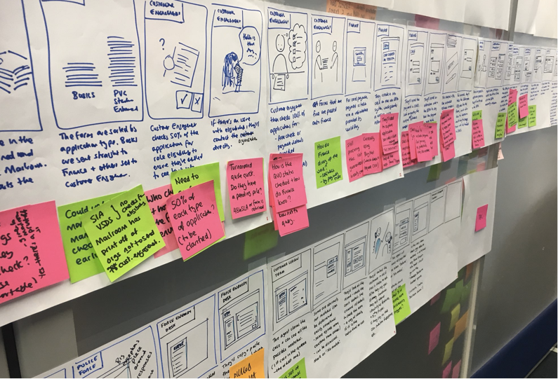
Storyboarding was a technique first developed by Walt Disney for his animated films. It’s a visual way of telling a story where you draw what is happening in every scene to describe a sequence of events and tell the story.
Hand drawings or simple pictures are an effective way to illustrate a story or user journey in this way. In his book Unfolding the Napkin, Dan Roan explains why hand drawings are so powerful:
…we like to look at things that match the way we think – hand drawn pictures are compelling precisely because they are imperfect. In other words, they work because they’e human.
The first thing we often think about when mapping user journeys or experiences is writing on post it or sticky notes. But drawing and using pictures can be the most effective way of describing an emotive experience, telling a story of what is happening now, or how something might work in the future.
2. User/Customer Experience Map
An experience map is focussed on understanding and capturing emotive feedback – what people are doing, as well as what they are thinking and feeling.
A good experience map will capture both the high and the low points of an experience people have across different stages of an end to end service. This will usually include how people anticipate doing something (what happens beforehand), and how they reflect on the experience (what happens afterwards).
Experience mapping is a great way of capturing and creatively mapping research insights as well as developing an understanding of opportunities for creating a better and more consistent experience for service users or customers.
3. User/Customer Journey Map
A journey map is less focussed on mapping an emotive experience and more about understanding the component parts and interactions across an end to end service, or for part of a service. It will either show an ‘as if’ understanding of a user journey – how something works at the moment. Or, it will show a future view and design – how we intend something to work in the future.
The most successful journey maps are used as living artefacts rather than project deliverables. When used effectively as a focal point for conversations to happen in teams, they enable decisions to be made with a better understanding of user needs within the context of an end to end service.
In service design, these type of maps should start with a user journey or a user experience. But they’re also tools for understanding, capturing and planning details for how a service operates. This means considering all the component parts, capabilities and processes that support its delivery. As with user experience (UX) design we’re looking to understand a user or customer experience, but, more broadly, service design needs to map interactions across all channels (online and offline) as well as administrative or back end systems and processes. This way teams can focus on how to improve or re-think a full end to end service, from how it operates to the end user experience.
4. User Story Map
A user story map or story mapping in an approach more commonly used in agile software and product delivery. In his book User Story Mapping, Jeff Patton explains that:
Stories in agile development get their name from how they should be used, not what you write down.
Story mapping is a great way of building a shared understanding of what you’re building and why. This approach is more focussed on the product or software components of a project. This way teams can prioritise what to build, but it’s not a full view of an end to end service with internal and supporting processes.
5. Service Blueprint
A service blueprint is more towards a design or technical plan for a service, or part of a service. This is usually an operational tool that visualises components in enough detail to analyse, implement, and maintain them. This detail can be used to analyse the business model underlying a service proposition, as well as revealing dependencies and helping to monitor performance across different touchpoints.
Teams might use a blueprint to link to other technical documents, or user stories and product level specification being developed, especially as part of technical delivery.
Blueprints often represent organisational design. They map the people and processes used to deliver different parts of services, as well as showing who owns what parts of a journey in an organisation, or across organisations.
These are some of the most common types of maps in user centred design. You could also include things like Service Architecture (which would sit below service blueprint in terms of technical detail) and System Mapping (which would sit somewhere in the middle). These artefacts/outputs are less likely to start from a user or customer perspective so they’re best considered separately.
In the lifecycle of designing, delivering or improving a service, you may well find that you progress through all of these different stages of mapping – moving slowly towards a final service blueprint that supports a live service. Service designers and teams also combine different approaches such as storyboarding and user or customer journey mapping.
Maps versus plans in service design
It’s important to think about whether you need to make a map, or whether you need to make a detailed plan.
Architecture provides us with a useful analogy:
In architecture, a map shows you where towns and buildings are. A plan shows how they are built, or intended to be built.
In service design, a map is useful for showing you where everything is – all the component parts of a service – giving you the context of how it’s all intended to work together starting from a user or customer perspective. A plan is then about providing a greater level of detail about how individual parts should work or need to be built.
Thought about in this way, planning is scoping that ideally sits and starts with conversations around a service map. This means connecting a design team together with product management and business analysis.
Getting started with service mapping
All the types of maps described here are useful in different contexts. The best place for teams to start is to think through the type of map that they need to make in order for it to be useful and usable in the context of their work.
These are questions to work through when getting started:
- What is the purpose of your map and who is it for?
or What conversations will this map support and with who? - Is it a research or design tool, or both?
Often maps start out as a way of bringing together observations and an understanding of user research. Think about whether you need to create an ‘as is’ map or whether you’re designing a future view of a service. For clarity, it usually makes sense to split ‘as is’ and future service maps into separate outputs or artefacts. - Is it intended to be tactical or inspirational?
Think about whether the purpose of your map is to support short-term improvements and quick-wins, or to inspire and support longer-term changes to a service. - Will a design, engineering, or operational team(s) use it to build out and deliver parts or all of a service?
If a maps intended purpose is for work with operational or engineering teams it might focus more on technical detail like a service blueprint, rather than capturing a more emotive experience. - Or, is its purpose to share new concepts and ideas throughout the organisation?
If a maps intended purpose is to communicate a future vision for a service inside an organisation, or with senior leaders, then more of a storytelling and visual approach could have the greatest impact.
Finally, maps are great for bringing teams together. Use them to deliver services that work better for your users or customers. It’s the activity of mapping that matters most, not the final artefacts you produce.
It would be great to hear your experiences of working with different types of maps when leading service design. You can get in touch with me directly.
This blog post is also published on Medium.
This is my blog where I’ve been writing for 20 years. You can follow all of my posts by subscribing to this RSS feed. You can also find me on Bluesky and LinkedIn.