Sticks in the ground
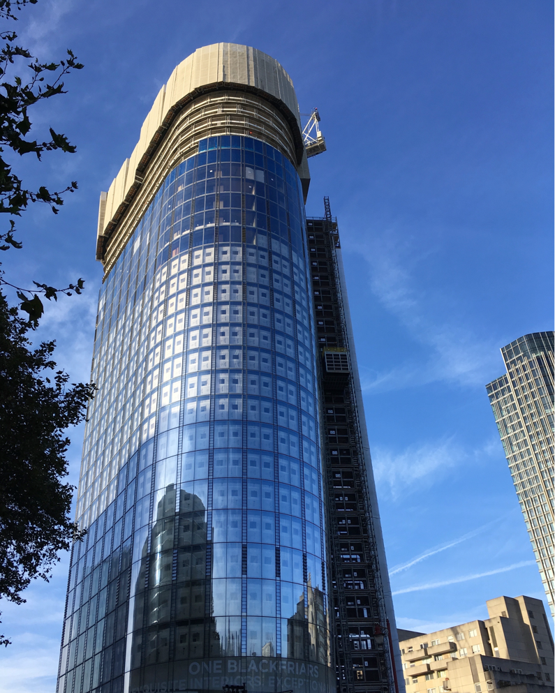
Last year I often walked past this skyscraper being built by Blackfriars bridge in London.

Like most of the modern London skyline it doesn’t pay much attention to anything around it. It just is. It’s statement architecture right there, rising slowly in front of all of us going about our business across the city. These buildings always feel to me like a designer or architect somewhere is putting sticks in the ground.
The modern London skyline now feels like a series of unmissable statements. It’s not subtle. Each new building is taller or reaching for something more seemingly impossible.
This type of architectural design is territorial. Buildings that need to exist in order to be seen. Statements of money and power. Designed as pure intent. Brash like youth but lacking the innocence.
The greatest profanity is the relationship these buildings have to everything else around them.
Design is arrogant
It’s arrogant to think you can change the world. But it’s also necessary.
Without great imagination we wouldn’t move forward – for better or for worse.
Great vision asks the question of what could exist without worrying too much (at least to start with) about what already exists in the world. This to me has always felt arrogant.
There’s an arrogance in deciding to build something different, bigger, taller or more impossible to feats of previous engineering and imagination.
Architecture understands this. Buckingham Palace was once arrogant. So was the Eiffel Tower (maybe they still are).
Fashion understands this. It’s arrogant because it is visionary. Fashion makes statements. It’s sometimes shocking, but you can’t argue with its ability to predict and shape the direction of culture and society.
Digital is starting to understand what it means to put sticks in the ground. As an idea, GOV.UK was arrogant (that’s why it’s good). I think it’s brutalism applied to a single government website. Radical simplicity, just as the buildings on London’s South Bank were statements of intent to change the dynamics at the heart of the city when they were first built.
If architecture can reshape cities, digital can now reshape public service design.
Design learns to be humble
When design is arrogant it must learn to be humble.
Being humble is about learning from our sticks in the ground. It’s about recognising what motivates us, and finding a positive vision for the physical spaces and people that our work will impact.
Design must always become more than just sticks in the ground. Just like fashion has to move beyond ego. It has to recognise and solve problems. A better city, or a better community. Not just a better building.
When design succeeds it knows where the other sticks in the ground are. Even when it stands out as progress it works to understand what it means to be part of the fabric of the city.
Letting progress be damned
The arrogance of design is hopelessly wayward if designers lack the ability to be humble. We must learn to be wrong, and, most of all, open minded.
We need designers who have the measure to take radical steps forward. But we also need those same people to be humble enough to listen, change direction and to understand, that ultimately, the design of everyday things becomes bigger than any individual.
Design has the potential to impact all of us (good or bad).
This is my blog where I’ve been writing for 20 years. You can follow all of my posts by subscribing to this RSS feed. You can also find me on Bluesky and LinkedIn.